top of page

OUR OWN
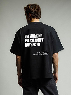
BRANDING
We’ve had an identity crisis. More than one.
We tried sounding important. It didn’t feel right. Too heavy, too corporate, too far from who we are.
So we stripped it back.
We dropped the fluff and kept what mattered. Boring. Clean, sharp, ironic.
Rebranding yourself is uncomfortable. You overthink, second-guess, and feel like you’re bullshitting yourself half the time. But we pushed through.
What’s left feels right.
Not polished. Not pompous.
Just Boring. Our kind of boring.

WE HAD AN
IDENTITY
CRISIS.


IF YOU'RE
LOOKING
FOR A SIGN.
THIS MIGHT BE IT,
OR NOT.


THANKS.

bottom of page